
Some of the best photos, paintings and layouts are composed using a guideline called the rule of thirds. Basically, you divide your “canvas” into equal parts horizontally and vertically. Then you place your focal point along the lines dividing you composition, as in the illustration below.

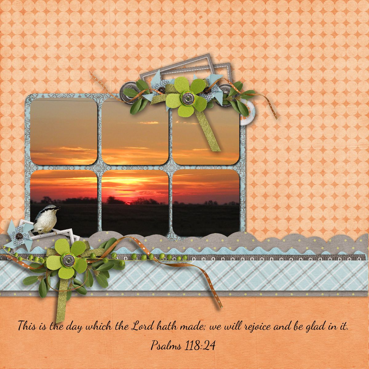
If you were taking a picture of a landscape you might place the horizon along the lower horizontal line. This will result in a more interesting composition than if you placed it smack dab in the middle of the page. In the layout below you’ll notice this principle is used twice. In the sunrise photo the horizon is placed on the imagined lower third and the photo as the focal point is centered vertically on the left third and the blue/grey elements & base of the photo are in the lower third.
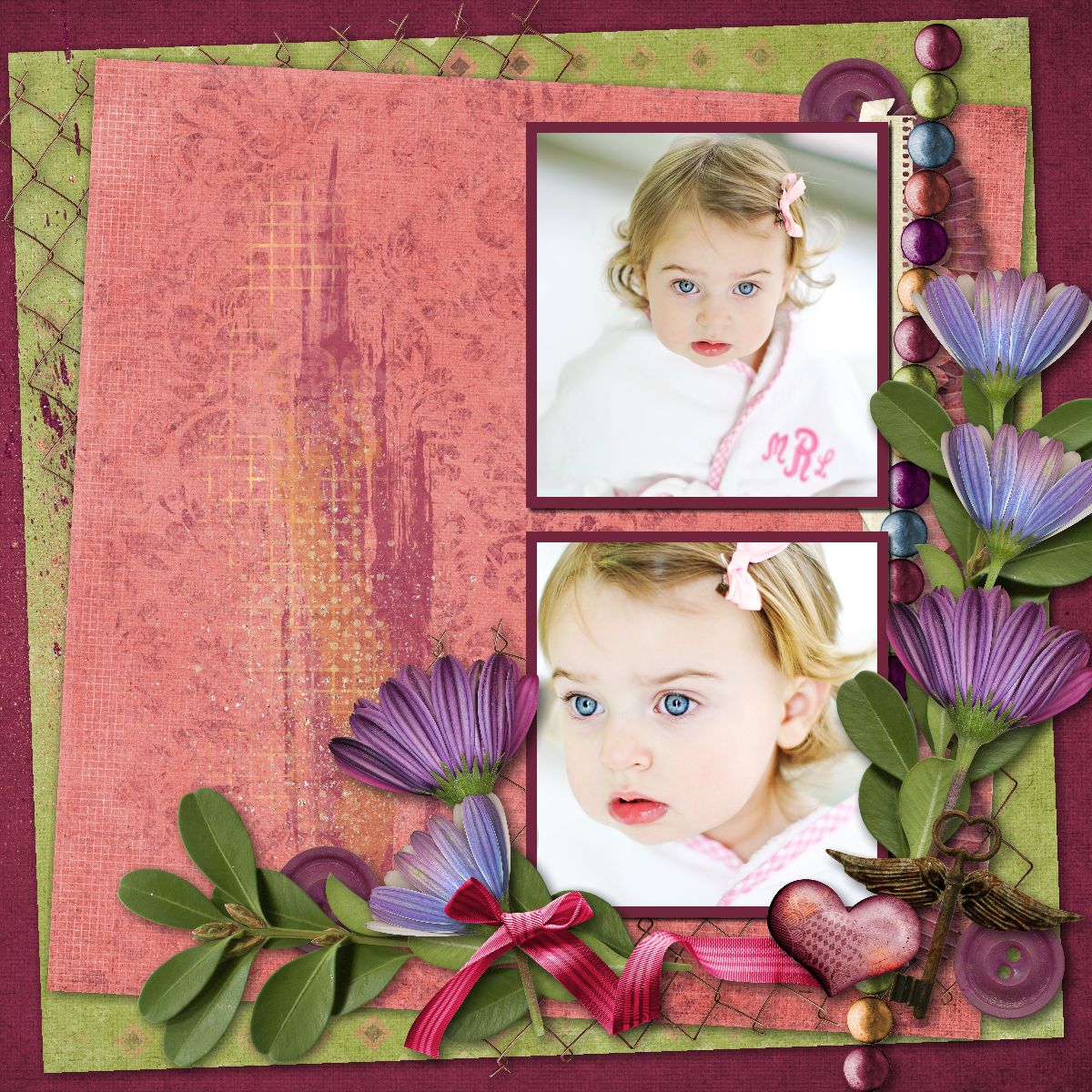
The next two layouts use the rule of thirds again. In addition, you may notice I cluster elements in a way to maximize flow. I want to lead your eyes around the page while drawing attention to the focal point. More about that in a future article.

Credits: Thirds layout made in Memory Mixer using Kimeric Kreations/Denim & Lace.
The remaining layouts made in MyMemories Suite
Sunrise layout using MMS Designer/Spring It On
Love layout Kimeric Kreations/Take Note
Bathing Beauty layout Kimeric Kreations/Summer Sunset
Photographer Linda Blackwell

Pingback: How to Use the Rule of Thirds in Design