Category Archives: Tip

Flash Photography for Beginners

Flash photography is challenging, especially for beginners.  Professional photographers may shoot in studio or outside but you can bet they have some great equipment that makes the most of the available light and they know all the tricks of the trade regarding flash.

Today I’m sharing a link to two videos that discuss various techniques you can use to make your photos look better when using flash.  I especially like the first video which compares the different looks achieved with a variety of flash choices.  I like that he uses people and different surroundings and lighting situations.  Both videos have great information and I hope you find them useful.  Check out the videos here.  Leave a comment if you think these tips will help you.

Camera Memory Cards Ins and Outs

Camera memory cards are something I’ve never thought much about.  I know I need one in my camera but I’ve never made an informed decision about which card to purchase.  Honestly, I probably just grab a card based on size and price more than anything else.  What about you?


If you, like me, have limited knowledge about the technology inside that little card I have great news.  I just read an article written by an industry insider with in-depth knowledge about memory cards. He has a lot of good information to share.  If you’d like to know more about the ins and outs of memory cards, I encourage you to read this article, Why You Should Not Delete Images on Your Memory Card Using Your Camera.

Top 5 Tips to Achieve Perfect Cluster Groups

Cluster groups are a scrapbook technique that baffles many scrappers.  Cluster groups are a great way to use some of the gorgeous embellishments included in kits and collections while improving the look of a scrapbook page layout.

Here are five key components to consider to achieve beautiful cluster groups.

  1. Repeat elements:  embellishments, papers, shapes, and colors.
  2. Odd numbers work best.  Three or five items always look better than two or four.
  3. Triangular arrangements work great in cluster groups and layout design.
  4. Place elements under, between and above photos and papers.
  5. Use clusters to move your eye around the page.

If you find it difficult to arrange clusters, try finding layouts or pre-made clusters that you like and study how the key components are applied.  Practice replicating the look in your own layouts.

First add several elements to use on a layout.  Then try multiplying, resizing, rearranging, and relayering to get the desired effect.  After all that if something just doesn’t seem to work, delete it.  As with anything new, it takes practice.  Since everything is digital it makes it super easy to practice.

Let’s explore a pre-made cluster.  A member of KimericKreations CT made this cluster using Kim’s Rustic Autumn kit.

cluster example

  1. The triangular shape is still apparent even in a more vertical design.
  2. Flower clusters-3 blue, 3 gold & 3 maroon flowers grouped and repeated 3 times.
  3. Blue leaves repeated 3 times.
  4. Banner flags-3 maroon flags, 3 plaid flags, 3 grey flags.
  5. Gold color repeated in heart & paint splatters at the top and middle, word art in the middle & circles at the bottom which also repeats the circular shape at the top and the clock in the middle.

When planning a cluster group it helps to copy/paste a minimum of three of each of the main items you plan to include.  Place them over to the side to start.  Then rotate and group some of them and place them in the general areas to make a triangle.  Some items, such as a single flair & single clock, work because the circular shape is repeated.

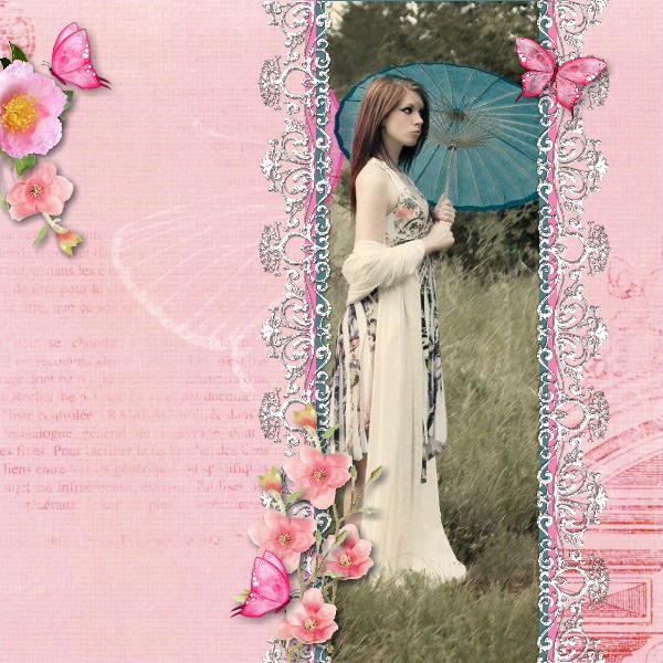
Now let’s look at a layout.  Instead of one cluster group, three groups create flow.

Slim vertical photo layout

Notice the general layout is triangular.  The cluster group on the top left, the butterfly on the top right and the clustering at the bottom use the five key components to move the eye around the layout.  Each cluster has an odd number of elements, three on the left, one on the right and five at the bottom.  The blue ribbon on each side of the photo ties in the blue umbrella.

If you are having trouble achieving beautiful cluster groups, try these five tips and see if they help.

How to Use the Rule of Thirds in Scrapbooking and Photography

The rule of thirds is a design principle that applies in all areas of creativity.  I wrote a post about using the rule of thirds in scrapbook design over two years ago.  You can find that post and some layouts using this rule here.  It actually comes quite naturally because it’s so aesthetically pleasing to our senses.


Today I found an article about using the rule of thirds in photography.  Photography is another creative area that most scrappers are compulsive about.  Read that article here.


We all know rules are made to be broken, right?  Yes, it’s easier to apply this rule when designing a scrapbook layout than in photography sometimes.  But do keep this in mind in your scrapping and photography endeavors.  Learn how to use the rule of thirds, practice it and watch your layouts and photography skills improve.  There’s a good reason rules are rules because they work!

Complementary Colors Pop

Creating contrast using complementary colors is a wonderful tool seen in many areas of design. Scrappers are also avid photographers.  As a photographer, you will appreciate this article about adding contrast to your images using complementary colors.  You can find the article here.


Get more in-depth information about color theory here.   You may already use color theory to enhance your photos and scrapbook layouts without even knowing it.  These color contrasts are all around us in nature and become intuitive.


If you’re not already using complementary colors in your designs you should start doing it now. This is one “secret” that will make your work stand out.  It’s the added pop you’ve been looking for.

Color Theory in Design

Color theory is a large part of many, if not all, areas of our creative lives.  Whether you’re an artist, photographer, fashion designer, interior designer, florist or scrapbooker, the colors you choose have a major impact on your composition.

I love color!  I love combining colors that will complement a layout or design.  That works out great since we have an almost endless supply of color choices.  There are tens of millions of colors in our wonderful world but they all start from three root colors.  The three primary colors when mixing paint are red, yellow and blue.  These are the root colors that can be combined to create every other imaginable color.

When you combine any two of the primary colors the resulting colors are referred to as secondary colors.  Most people know you combine red + yellow to get orange, yellow + blue produces green and blue + red equals purple.  These are the secondary colors-orange, green and purple.

Combining a primary color with it’s closest secondary color produces six tertiary.  Think of it like a family tree.  The primary colors are the parents, their children the secondaries and the tertiary are grandchildren.  The tree just keeps expanding to produce an endless array.


Light passing through a prism mixes a little differently.  The transmitted primary colors are the color of the light source itself and are red, green and blue.  The mixing of these colors of light is how television mixes light to get colors.

Keep in mind it’s not necessary to understand everything there is to know about the two types of primaries because the end result is that using different colors in relation to one another is the same regardless of the set of primaries.

How you combine colors in your layout is where the magic begins. Some colors just seem to work better together to achieve a pleasing design.  A color wheel is a great reference tool to easily learn which combinations work best.  Use color theory to take you scrapbook layouts to a new level.

Hashtags Tell the Story

Hashtags are still somewhat of a mystery to me but I’ve realized I can use hashtags to tell the story on a scrapbook page.  My husband recently asked me to explain the use of hashtags. I couldn’t really give him a good explanation, because I still don’t really get it myself, but I can use them in a less conventional way that makes sense to me.  Hashtags can say it all.  They can tell the story!

Hashtag Feel the Burn

I love finding new and different ways to tell the story in a layout.  Sometimes a great title is all you need.  I’ve also used titles with subtitles to give a little more information.  One thing I especially like about using hashtags is they also tell a separate story about something that’s popular at a particular time in history.  #hashtags #tellthestory #saymorewithless

Photo-less Layouts

What do you think about photo-less layouts?  I’ve heard people say they haven’t scrapped lately because they don’t have any great photos or they don’t feel inspired.  What about scrapping less than perfect photos or no photos at all?  Sometimes just getting started is the hardest part.

I think layouts without photos are another great way to record everyday life.  When you look at old photos from your parents, grandparents or even great great grandparents do you ever wonder what everyday life was like for them.  Do you wish you had more insight into their thoughts and dreams?  I know I do.

Here are a few ideas for layouts using something besides photos:

  • Inspirational or favorite quotes
  • Favorites lists (a great thing to do each birthday)
  • Funny things your kids say or do (out of the mouth of babes)
  • Facts about someplace you visited
  • Birth statistics
  • Invitations

If you think about yourself and some of the things you wish you knew about your ancestors or things you’d like future generations to remember about you & your immediate family it’s easy.

I love Dr. Seuss and I’ve passed that love down to my son & he’s passed it down to his kids. Dr. Seuss had some profound things to say.  Here’s a layout made with one of my favorite quotes.

Youer Than You quote

A page like this in a family album would bring smiles to some faces and open up conversations about how much we all loved Dr. Seuss.  Add Happy Birthday!  across the top & it would make a very cute birthday card.

Top 5 Shadowing Don'ts

While I consider shadowing a must, there are a few things you don’t want to do.  There are many different type of objects that can be used on a page.  Obviously, I can’t cover every possibility for shadowing but these are some important reminders for the most frequently used items that call for a shadow.

1. DON’T leave things hovering over your page.  Hummingbirds and butterflies may hover but most elements should not.  Doesn’t this row of dots look a bit odd?  Too much of a shadow makes elements look like they’re floating above your page.

floating

2. DON’T leave them off the page either.  A layout without shadows will appear flat and lack dimension but the right amount will enhance your page.

Flat

3. DON’T shadow text, splatters or imprints since they’re not usually ‘thick’ enough to cast a shadow.  These things look all wrong when shadows are added, you may even think you’re having double vision!

Double Vision

4. DON’T forget where your ‘light source’ is coming from.  When I’m working on a layout my lamp is over my left shoulder.  This helps me remember where my ‘light source’ is.  it’s a confusing mess when shadows go every which a way!

Every Which Way


5. DON’T forget you are trying to make your layout look as realistic as a traditional page.  It’s even better than a traditional layout.  It looks great but lies flat when printed and you don’t have all the mess to clean up when you’re done.  Have fun!