Just a reminder for today, smile like you mean it! If you smile like you mean it, before you know it you will mean it. You could make someones day. Best of all, it looks good on you!

Just a reminder for today, smile like you mean it! If you smile like you mean it, before you know it you will mean it. You could make someones day. Best of all, it looks good on you!
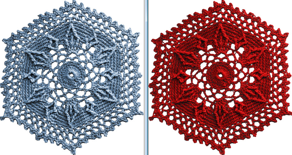
Have you ever found the perfect element you’d like to use but it’s the wrong color? Did you know it’s easy to change the color of elements to the perfect color? Yep, that right, you can do it with one click! Check out this easy tutorial.
Maybe you’ve wondered how that special blouse would look in a different color. It’s easy to find out! Or maybe you’re fixing to post a photo but think you’d look a lot better if you had worn you royal blue instead of light blue. No problem, you’re just one-click away from perfection. You may not be able to buy one in every color but it can look like you did!
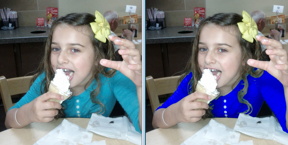
There, now that looks better. Post that baby then let’s all have some ice cream!
This works for elements on your digital scrapbook pages too. One-click, new color!
I love to put pockets on pages. What about you? I just think the look of stuff spilling out looks so neat. I found a pretty easy way to do it in PaintShop Pro x6 so I wrote a tutorial. On this page, I just added a pocket on this page as part of the embellishments. Making pockets and pocket pages adds another option when you have a lot more than just photos to keep.

I wrote the tutorial on how to make an entire page that’s a pocket because sometimes you just have too much stuff for one little pocket! Right? You can find the tutorial here.
I welcome your comments and I’d love to see your layouts on my Facebook group. You’ll find it here https://www.facebook.com/groups/digiscrappingtipsgroup/
Everything on this page was created by me using Paintshop Pro x6.
While I consider shadowing a must, there are a few things you don’t want to do. There are many different type of objects that can be used on a page. Obviously, I can’t cover every possibility for shadowing but these are some important reminders for the most frequently used items that call for a shadow.
1. DON’T leave things hovering over your page. Hummingbirds and butterflies may hover but most elements should not. Doesn’t this row of dots look a bit odd? Too much of a shadow makes elements look like they’re floating above your page.

2. DON’T leave them off the page either. A layout without shadows will appear flat and lack dimension but the right amount will enhance your page.

3. DON’T shadow text, splatters or imprints since they’re not usually ‘thick’ enough to cast a shadow. These things look all wrong when shadows are added, you may even think you’re having double vision!

4. DON’T forget where your ‘light source’ is coming from. When I’m working on a layout my lamp is over my left shoulder. This helps me remember where my ‘light source’ is. it’s a confusing mess when shadows go every which a way!

5. DON’T forget you are trying to make your layout look as realistic as a traditional page. It’s even better than a traditional layout. It looks great but lies flat when printed and you don’t have all the mess to clean up when you’re done. Have fun!
Shadowing is very important on your digital scrapbook layout to achieve a more realistic look. Shadows add depth and dimension to an otherwise flat design. If you’re making a traditional paper layout, shadows are ‘built in’. Since the elements are truly dimensional they automatically cast shadows. That makes sense, right? When creating digital layouts you should try to add realistic looking shadows.
Here is my list of the top 5 DO’s when adding shadows to your digital designs.
1. DO consider how ‘thick’ an element is & how much shadow it would cast if it were ‘real’. Paper & card stock don’t cast the same shadow as ribbon, buttons or flowers. The photo below demonstrates how shadows are cast naturally for items of various thicknesses.

2. DO think about your ‘light source’ and cast the shadow away from it. If light is coming from above & to the left the shadow will fall below & to the right. The photo above is a perfect example of this.
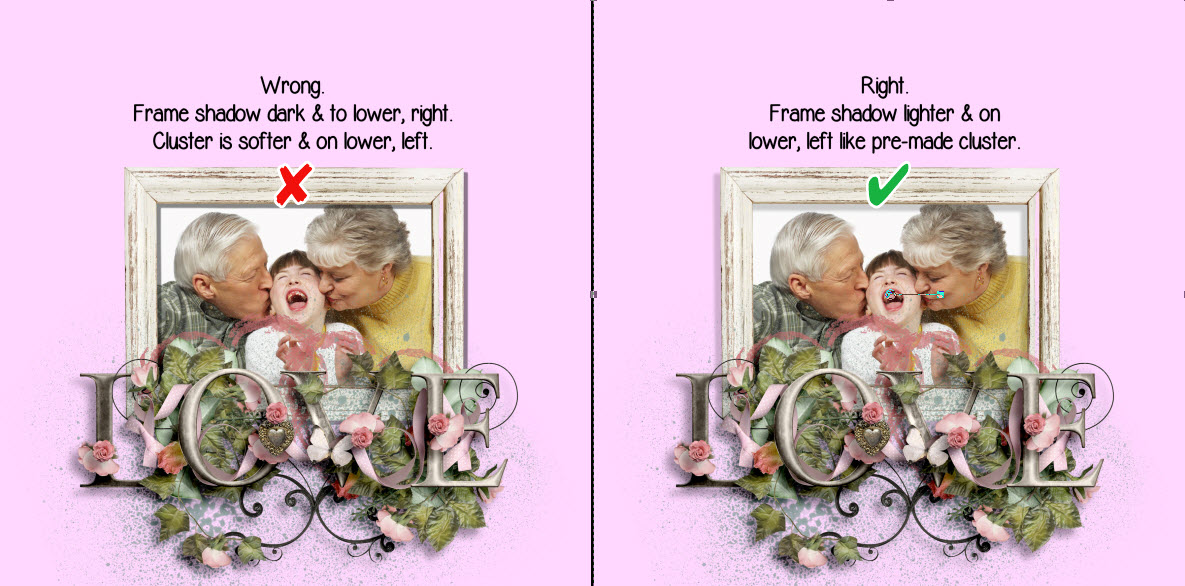
3. DO match the shadow direction for all elements on the layout. Tip: If you’re using a pre-made, pre-shadowed cluster try to match the shadowing on any other elements you add. In the photos below I used a pre-made pre-shadowed cluster. Most people tend to shadow to the right & below but the cluster was pre-shadowed to the left & below. The shadow for the frame looks much better on the right example. The frame shadow is slightly darker because it is closer to the page than the cluster.
4. DO remember the thicker the element, the lower the opacity should be. A lower opacity makes shadows more transparent. Notice in the above example you can see the splatter below the cluster, through the shadow, because the lower opacity makes it transparent.
5. DO raise the blur setting for ‘thicker’ elements. This will create a lighter, less defined shadow. Thinner elements shadow will be darker and more defined.
I hope these top 5 shadowing do’s are helpful. Stay tuned for some shadowing dont’s I’ll be posting in a couple of days. What do you think? Do you agree? Your comments are welcome.