Category Archives: Techniques

Photo Spill Frame or Out of Bounds?

Photo Spill Frame or Out of Bounds?  I’ve had several people ask me the difference between them.  I believe the difference is in the precision.  A Photo Spill Frame is out of bounds but an Out of Bounds effect is not necessarily a Photo Spill Frame!  Let me elaborate.

The “bounds” I’m speaking of is the photo’s frame.  So Out of Bounds is a technique where the photo is not contained within the boundaries of the frame.

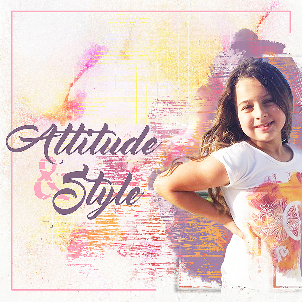
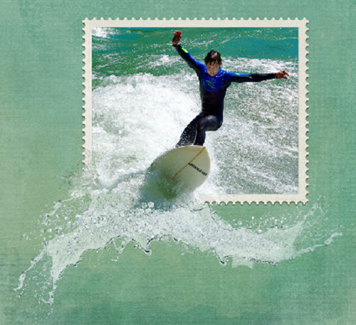
When I think of the Out of Bounds effect I think about arms, hands, heads, leaves, or something similar extending outside of the frame.  Here are a couple of examples of what I mean when I talk about an Out of Bounds effect.   The surfer’s arms and head extend beyond the frame in the first example.  In the second example, the woman’s feet are out of bounds.


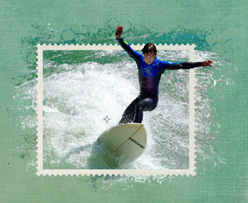
A Photo Spill Frame effect makes me think of something spilling out over the frame.  While it’s still technically an out of bounds effect it’s not as precise as the examples above.  Water and waves are perfect subjects for this effect but not the only possibilities.  Consider anything that can, well, spill or overflow.  The technique I use in each case is also different.  Here are a couple of examples.  I used the surfer photo again for the first Photo Spill Frame example to see the difference in the two effects on the same photo.  I also added a wave element here.

Here’s an example of a different type of Photo Spill.  As you can see it’s larger & less precise.


If you’d like to find out how to create a layout using the Photo Spill Frame effect using Photoshop Elements check out my tutorial, How to Create a Photo Spill Frame Effect.  I hope you will enjoy and use this effect in some of your layouts.  What ideas do you have for other items that can spill over the edge of the frame?  Please comment and share your ideas.


Credits:  The layout examples were created using various elements from the following kits:

A Day at the Beach, Everyday Stories-Home, and Kraft Party by Kimeric Kreations.

Using Extractions and Blend Modes in Photoshop Elements 15

If using extractions and blend modes in Photoshop Elements is still a bit of a mystery to you check out my tutorial here.  The more I see and use artistic effects the more I love them.  In this tutorial, I take you through my process step by step.  So follow along and add your own tricks to achieve an artistic layout you will love.  There are many ways to do things in Photoshop Elements and this is just one way.  So check it out and let me know what you think.

attitude and style

Kit: Precious  *  Designer: NBK Designs  *  Font: Master of Break  *  Font: TXT Abrasive

so-cool-marquee

The Magic of Beginnings Collaboration at Scrapaneers

The Magic of Beginnings huge digital collaboration has started at Scrapaneers.  For the entire month of December look for a new blog post every Monday, Wednesday, and Friday with tutorials and freebies.  Here’s a preview of this amazing collaboration.

the-magic-of-beginnings-preview


Yesterday, December 2, there was a fantastic tutorial about creating animated GIFs in Photoshop.  Have you ever thought about adding a flashing title to your layout?  This is so cool! Check out Judie’s tutorial here.   In addition to learning a fabulous new technique, you can download Etc by Danyale’s portion of the collab and an Alpha set from Artful Musings.

Free Mini Kit Preview

etc-by-danyale-mini


Free Alpha Set Preview


artful_marqueealpha_preview


GIFs can be created in Photoshop Elements as well.  I created the “So Cool” GIF in PSE15.

Top View Scrapbook Layout

Top View Design

Desk top view is a trend that’s been around awhile in web design and I’ve based this layout on the view from above.  This trend relies heavily on viewing items on a desk or table top from first person perspective.  This type of layout works best using realistic-looking objects.  You can find realistic items in some kits or extract them yourself.

A “Snapshot” Layout

Most of the items used for this layout are from ET Designs kit, In My Kitchen.  The iPhone and granite background are from my own stash.  With realism in mind, objects should be sized appropriately in comparison with other items in the arrangement.  It should feel like a snapshot of the activity depicted in the layout.

in-my-kitchen-topview

Can you think of ways you can incorporate top view in some of your layouts?

Top 5 Tips to Achieve Perfect Cluster Groups

Cluster groups are a scrapbook technique that baffles many scrappers.  Cluster groups are a great way to use some of the gorgeous embellishments included in kits and collections while improving the look of a scrapbook page layout.

Here are five key components to consider to achieve beautiful cluster groups.

  1. Repeat elements:  embellishments, papers, shapes, and colors.
  2. Odd numbers work best.  Three or five items always look better than two or four.
  3. Triangular arrangements work great in cluster groups and layout design.
  4. Place elements under, between and above photos and papers.
  5. Use clusters to move your eye around the page.

If you find it difficult to arrange clusters, try finding layouts or pre-made clusters that you like and study how the key components are applied.  Practice replicating the look in your own layouts.

First add several elements to use on a layout.  Then try multiplying, resizing, rearranging, and relayering to get the desired effect.  After all that if something just doesn’t seem to work, delete it.  As with anything new, it takes practice.  Since everything is digital it makes it super easy to practice.

Let’s explore a pre-made cluster.  A member of KimericKreations CT made this cluster using Kim’s Rustic Autumn kit.

cluster example

  1. The triangular shape is still apparent even in a more vertical design.
  2. Flower clusters-3 blue, 3 gold & 3 maroon flowers grouped and repeated 3 times.
  3. Blue leaves repeated 3 times.
  4. Banner flags-3 maroon flags, 3 plaid flags, 3 grey flags.
  5. Gold color repeated in heart & paint splatters at the top and middle, word art in the middle & circles at the bottom which also repeats the circular shape at the top and the clock in the middle.

When planning a cluster group it helps to copy/paste a minimum of three of each of the main items you plan to include.  Place them over to the side to start.  Then rotate and group some of them and place them in the general areas to make a triangle.  Some items, such as a single flair & single clock, work because the circular shape is repeated.

Now let’s look at a layout.  Instead of one cluster group, three groups create flow.

Slim vertical photo layout

Notice the general layout is triangular.  The cluster group on the top left, the butterfly on the top right and the clustering at the bottom use the five key components to move the eye around the layout.  Each cluster has an odd number of elements, three on the left, one on the right and five at the bottom.  The blue ribbon on each side of the photo ties in the blue umbrella.

If you are having trouble achieving beautiful cluster groups, try these five tips and see if they help.

How to Use the Rule of Thirds in Scrapbooking and Photography

The rule of thirds is a design principle that applies in all areas of creativity.  I wrote a post about using the rule of thirds in scrapbook design over two years ago.  You can find that post and some layouts using this rule here.  It actually comes quite naturally because it’s so aesthetically pleasing to our senses.


Today I found an article about using the rule of thirds in photography.  Photography is another creative area that most scrappers are compulsive about.  Read that article here.


We all know rules are made to be broken, right?  Yes, it’s easier to apply this rule when designing a scrapbook layout than in photography sometimes.  But do keep this in mind in your scrapping and photography endeavors.  Learn how to use the rule of thirds, practice it and watch your layouts and photography skills improve.  There’s a good reason rules are rules because they work!

Learn How to Use Photo Tiling in MyMemories Suite v6

I remember when photo tiling was first added to MyMemories Suite. I could hardly wait to learn how to do it.  I thought it was the coolest feature ever.  It’s very easy to do and really adds something special to a layout.  I recently wrote a tutorial about using the Group tool.  Photo tiling is one of the effects that uses the Group tool.  Below is a page from the tutorial.  You can find the complete tutorial here.

Grouping Elements Tutorial-010

When grouping animals or people be careful not to chop them up!  That is just not right, lol.  Here’s a page I made quite a while ago.  As you can see, it’s sometimes difficult not to chop off a shoulder or some hair.  Remember, you can always ungroup the photo and tweak the placement of each separate piece. But please don’t split anyone down the middle!

Photo Tiling in My Memories

Landscapes are pretty safe though and look really neat.

Sunrise

Complementary Colors Pop

Creating contrast using complementary colors is a wonderful tool seen in many areas of design. Scrappers are also avid photographers.  As a photographer, you will appreciate this article about adding contrast to your images using complementary colors.  You can find the article here.


Get more in-depth information about color theory here.   You may already use color theory to enhance your photos and scrapbook layouts without even knowing it.  These color contrasts are all around us in nature and become intuitive.


If you’re not already using complementary colors in your designs you should start doing it now. This is one “secret” that will make your work stand out.  It’s the added pop you’ve been looking for.

Color Theory in Design

Color theory is a large part of many, if not all, areas of our creative lives.  Whether you’re an artist, photographer, fashion designer, interior designer, florist or scrapbooker, the colors you choose have a major impact on your composition.

I love color!  I love combining colors that will complement a layout or design.  That works out great since we have an almost endless supply of color choices.  There are tens of millions of colors in our wonderful world but they all start from three root colors.  The three primary colors when mixing paint are red, yellow and blue.  These are the root colors that can be combined to create every other imaginable color.

When you combine any two of the primary colors the resulting colors are referred to as secondary colors.  Most people know you combine red + yellow to get orange, yellow + blue produces green and blue + red equals purple.  These are the secondary colors-orange, green and purple.

Combining a primary color with it’s closest secondary color produces six tertiary.  Think of it like a family tree.  The primary colors are the parents, their children the secondaries and the tertiary are grandchildren.  The tree just keeps expanding to produce an endless array.


Light passing through a prism mixes a little differently.  The transmitted primary colors are the color of the light source itself and are red, green and blue.  The mixing of these colors of light is how television mixes light to get colors.

Keep in mind it’s not necessary to understand everything there is to know about the two types of primaries because the end result is that using different colors in relation to one another is the same regardless of the set of primaries.

How you combine colors in your layout is where the magic begins. Some colors just seem to work better together to achieve a pleasing design.  A color wheel is a great reference tool to easily learn which combinations work best.  Use color theory to take you scrapbook layouts to a new level.