Category Archives: DigiScrappingTips

How To Remove Front and Back Cover in My Memories Suite

Have you ever wished your album didn’t have pages designated for a front cover and a back page in My Memories Suite?  I have and I know others have asked about this.  It’s a very easy fix.

Get the appearance you want in two easy steps found herePageSpreadsGo to View> and check Page Spreads you’ll be able to view two pages side by side.

Top 5 Shadowing Don'ts

While I consider shadowing a must, there are a few things you don’t want to do.  There are many different type of objects that can be used on a page.  Obviously, I can’t cover every possibility for shadowing but these are some important reminders for the most frequently used items that call for a shadow.

1. DON’T leave things hovering over your page.  Hummingbirds and butterflies may hover but most elements should not.  Doesn’t this row of dots look a bit odd?  Too much of a shadow makes elements look like they’re floating above your page.

floating

2. DON’T leave them off the page either.  A layout without shadows will appear flat and lack dimension but the right amount will enhance your page.

Flat

3. DON’T shadow text, splatters or imprints since they’re not usually ‘thick’ enough to cast a shadow.  These things look all wrong when shadows are added, you may even think you’re having double vision!

Double Vision

4. DON’T forget where your ‘light source’ is coming from.  When I’m working on a layout my lamp is over my left shoulder.  This helps me remember where my ‘light source’ is.  it’s a confusing mess when shadows go every which a way!

Every Which Way


5. DON’T forget you are trying to make your layout look as realistic as a traditional page.  It’s even better than a traditional layout.  It looks great but lies flat when printed and you don’t have all the mess to clean up when you’re done.  Have fun!


Top 5 Shadowing Do's

Shadowing is very important on your digital scrapbook layout to achieve a more realistic look.  Shadows add depth and dimension to an otherwise flat design.  If you’re making a traditional paper layout, shadows are ‘built in’.  Since the elements are truly dimensional they automatically cast shadows.  That makes sense, right?  When creating digital layouts you should try to add realistic looking shadows.

Here is my list of the top 5 DO’s when adding shadows to your digital designs.

1. DO consider how ‘thick’ an element is & how much shadow it would cast if it were ‘real’.  Paper & card stock don’t cast the same shadow as ribbon, buttons or flowers.  The photo below demonstrates how shadows are cast naturally for items of various thicknesses.

Various Depth Items

2. DO think about your ‘light source’ and cast the shadow away from it.  If light is coming from above & to the left the shadow will fall below & to the right.  The photo above is a perfect example of this.

3. DO match the shadow direction for all elements on the layout.  Tip: If you’re using a pre-made, pre-shadowed cluster try to match the shadowing on any other elements you add. In the photos below I used a pre-made pre-shadowed cluster.  Most people tend to shadow to the right & below but the cluster was pre-shadowed to the left & below.  The shadow for the frame looks much better on the right example.  The frame shadow is slightly darker because it is closer to the page than the cluster.

Wrong vs Right

4. DO remember the thicker the element, the lower the opacity should be.  A lower opacity makes shadows more transparent.  Notice in the above example you can see the splatter below the cluster, through the shadow, because the lower opacity makes it transparent.

5. DO raise the blur setting for ‘thicker’ elements.  This will create a lighter, less defined shadow.  Thinner elements shadow will be darker and more defined.

I hope these top 5 shadowing do’s are helpful.  Stay tuned for some shadowing dont’s I’ll be posting in a couple of days.  What do you think?  Do you agree?  Your comments are welcome.


Take Your Scrapping Skills to a Whole New Level with Art Journaling!

I LOVE art journaling, it is so creative and looks amazing!  It will take you scrapping skills to a whole new level.  In case you’re not sure what I’m talking about I’ve included some examples below of some awesome art journaling techniques.

art journaling

I’ve been looking for a tutorial for quite a while and now I’m so happy to have found a class “The Art of Journaling”.  As you can tell, from the examples above, this is not your everyday, run of the mill journaling.  This is art in and of itself.  So let me tell you more about the class.

art journaling class

Click this link Art of Journaling by Amanda Taylor to register.  This workshop starts March 3. It is actually three classes using Photoshop Elements 10+ or Photoshop CS4+.  It is skill level beginner to intermediate so you don’t need to be an expert in the software but you do need to be familiar with the product.  The workshop starts in 10 days so hurry on over and sign up.  I think it will be a lot of fun and it will definitely be an asset to your scrapbooking layout designs.  If you want to learn journaling as an art form click here.

Photo Tiling Tutorial is Now Available

Have you seen any layouts using the photo tiling feature in My Memories Suite?  That is one of my favorite features added in version 4.  If you love the look too, I’ve created a tutorial to show you how to use photo tiling in your layouts.  You can find the tutorial here and I’ve included another example below using this feature.

This example is very similar to one of the layouts in the tutorial but for this layout I used the original photo for the entire background.  I also used the photo effect feature to change it to black & white.

What About Blog Posts-004

Setting Preferences

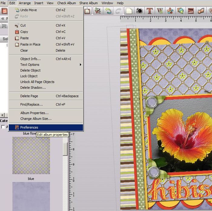
Setting preferences is a time saving feature available in both My Memories Suite and Memory Mixer scrapbooking software.  Do you find yourself using the same fonts, shadows or other features time and time again?  Did you know you can set your preferences to apply throughout an entire album?  Setting preferences will save you time and still give you freedom to tweak things when you want. To set preferences choose Edit> Preferences.

Edit PreferencesYou can set your preferred font for the album you are working on and each album can have the same or different preferences.  As you can see below, you can set the preferred font type & size, bold, italics, underline, alignment and color.

Font Preferences
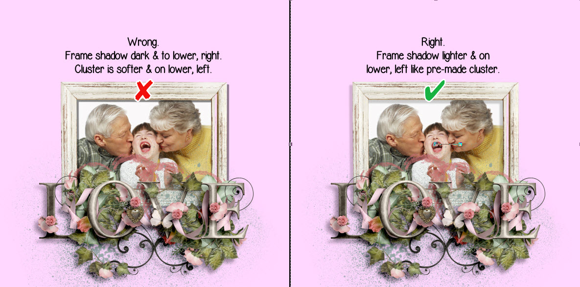
You can also change the shadows for each element so your photos, shapes, embellishments and text shadows are all uniform.  Although I set a default for my embellishments I tweak them based on their “thickness”.  Remember with digital scrapping you need to consider how thick an item would be if you were paper scrapping.  If I’m using an embellishment, such as a thick flower, that would stand off the paper more than other embellies I will decrease the opacity and increase the blur.  Thinner items would have a darker, sharper shadow (higher opacity with less blur).  I don’t add a shadow to text that would appear hand written so I wouldn’t set a shadow for text.  If I’m using text as a title that would traditionally be raised, I’ll add a shadow to it.

Shadow PreferenceIf you use the grid or snap to grid feature you can also set these preferences as well.  You can display the grid based on pixels, inches or millimeters.

Grid PreferencesIn addition, you can set the following items as desired.  Captions, if checked, will enable auto caption which will display the name of the photo file below the photo.  Photo Cache uses caching technology to store thumbnails and make loading quicker.  You can also show or hide warning messages.  These messages differ in each program.

I think setting your preferences is definitely worth the effort and will make your album uniform while allowing you to tweak the settings as desired.


What Makes a Good Album Cover?

What makes a good album cover for the scrapbook you’re making of your honeymoon or family vacation?  I think using one of the photos from your trip works perfectly.  You can add a smaller photo of the happy couple or family, depending on the occasion, to further personalize the album.  If you’re using MyMemories Suite it’s easy to make a title using the same photo that you used for the background.  There is no need for any additional embellishments.   In the end you’ll have a cover that looks professionally designed.

If you’d like to find out how to make an album cover like this check out this short tutorial.

The Who, What, When, Where and Why of Sketchbooks

Some scrappers may wonder, “Who uses sketches?”, “What are they?”, “When would I use one?”, “Where do I start?”, and “Why would I need to use a sketch?”.  If you have found yourself asking these questions you’ll be interested in the article I posted here.

You may or may not need to use sketches.  You may need them some of the time but not all the time.  But if you are new to scrapping or find yourself needing a little push sometimes a sketch is one way to get you going.  So hop over and find answers to your questions if you’ve been wondering.

If you agree you need a little push in the right direction my Kindle eBook will help you.  It’s loaded with sketches and full color examples you can use right now.


http://rcm-na.amazon-adsystem.com/e/cm?t=scraptdesign-20&o=1&p=8&l=as1&asins=B00DSVP5P8&ref=qf_sp_asin_til&fc1=000000&IS2=1&lt1=_blank&m=amazon&lc1=0000FF&bc1=000000&bg1=FFFFFF&f=ifr

There's More to Photo-Tiling Than Just Photos

I just posted a tutorial for a new feature of My Memories Suite v4.  It’s my favorite new feature and I’ve used it a lot.  I also like to do color-blocking in layouts and it finally occurred to me that I could probably use the photo tiling for color blocking as well.  After all there is technically no difference between a photo or a background paper.  So I’ve done a tutorial to show you how to do it too.  Please let me know if you find it beneficial.  You can also let me know if you have any questions.  Either way I hope to hear from you.  Click here to check out the tutorial.

I’ve also written a review of this feature at DigiScrappingDivas.com.  If you’d like to read my brief review you’ll find it here.  Happy Scrapping!